
Top Tips for Picking Paint Colors That Complement Your Furniture
Choosing the right home paint colors can feel like solving a puzzle—especially when you want them to complement your furniture. Whether you’re refreshing a single room or overhauling your entire house, the interplay between walls and furnishings sets the tone for your space. Imagine walking into a room where the vibrant teal sofa clashes with neon-orange walls—yikes! Avoiding such mishaps requires more than luck; it demands a strategic approach to color combinations for rooms. From analyzing undertones to balancing modern aesthetics, this guide dives into actionable tips to ensure your wall paint colour choices elevate, rather than compete with, your decor. Let’s transform your home into a cohesive sanctuary.
1. Understand the Color Wheel Basics
Ever wondered why some colors for rooms feel effortlessly harmonious? The secret lies in the color wheel. This timeless tool reveals relationships between hues, helping you pair furniture and walls with confidence. For instance, complementary colors (opposites on the wheel, like navy and gold) create bold contrasts, while analogous colors (neighbors, like sage and seafoam) offer subtle cohesion.
Take a blue velvet couch: pairing it with terracotta walls (blue’s complement) adds drama, while soft gray walls (analogous to blue) keep things serene. The Pantone Color Institute emphasizes that understanding these relationships prevents clashing and balances visual weight.
But don’t stop there. Consider split-complementary schemes for softer contrast—ideal for modern home paint colors that feel fresh yet timeless. For example, pair a charcoal sofa with mint-green walls and coral accents. This approach works wonders in open-concept spaces where color combinations for home need to flow seamlessly.
2. Analyze Your Furniture’s Undertones
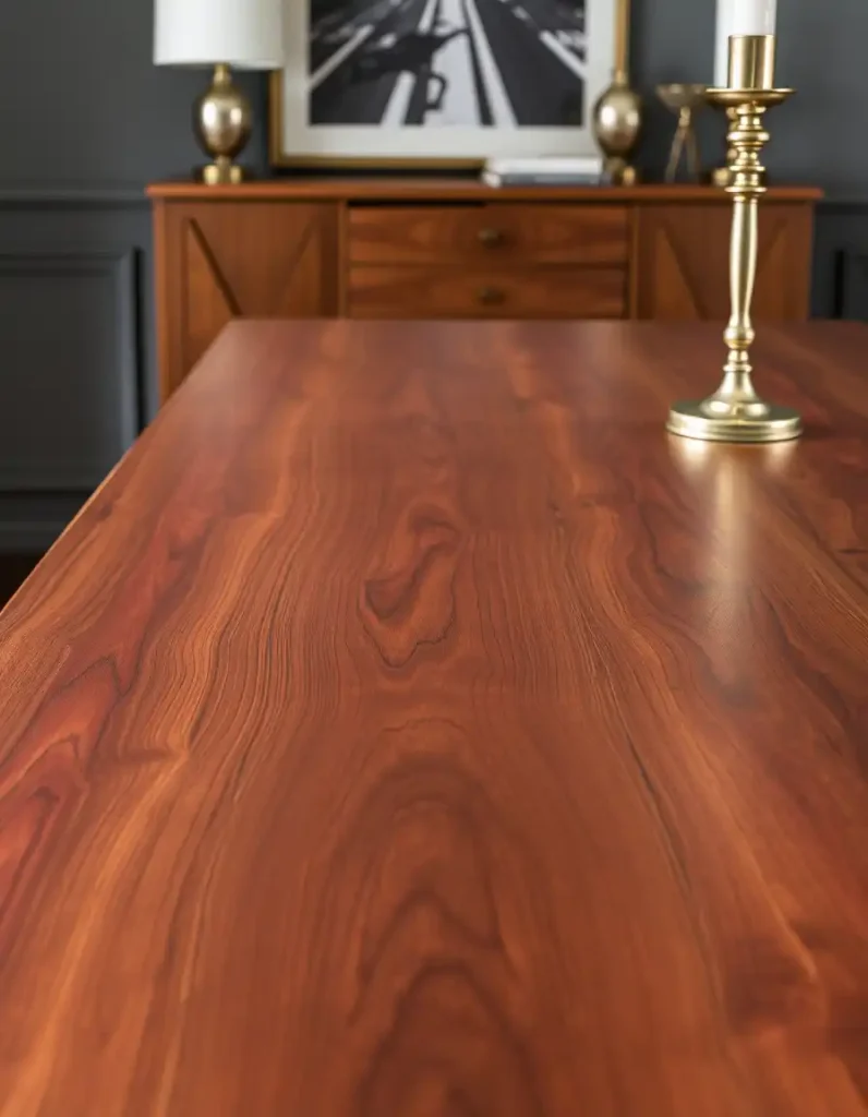
Your furniture isn’t just brown or beige—it has hidden undertones that dictate which wall paint colour will harmonize. Warm woods like cherry or mahogany have red or yellow undertones, pairing beautifully with creamy whites or olive greens. Cool-toned furniture (think ash-gray or sleek metal) thrives alongside icy blues or crisp grays.
Case in point: A client once painted their living room a trendy cool gray, only to realize their oak floors looked oddly orange. The fix? Switching to a warm greige wall color neutralized the clash. Tools like Sherwin-Williams’ ColorSnap let you upload furniture photos to test pairings digitally—no paint swatches required!
For upholstered pieces, drape a white cloth over them to isolate undertones. If the fabric leans pinkish, opt for walls with warm bases. If it feels bluish, cooler tones will complement best.
3. Consider Room Function and Mood
Should a bedroom and kitchen share the same palette? Unlikely. Room function heavily influences ideal color combinations for rooms. Energizing hues like sunflower yellow or coral shine in kitchens (perfect for kitchen wall colors), while calming blues or soft lavenders suit bedrooms.
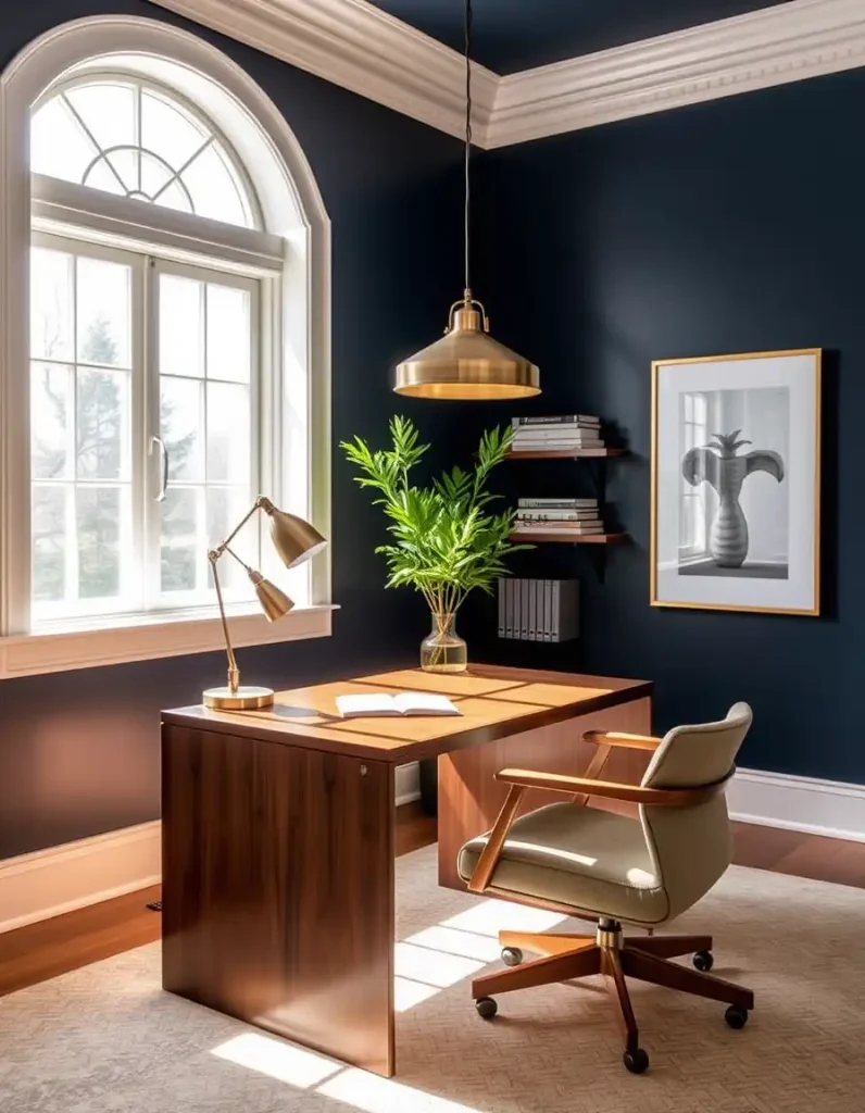
Psychologists at Color Psychology Today note that warm tones stimulate conversation—ideal for dining rooms—while cool hues promote relaxation. For a home office, try muted greens to boost concentration without overwhelming.
Don’t forget ceilings! A bold ceiling color (like matte black in a loft) can anchor a room, drawing the eye upward without competing with statement furniture.
4. Test Samples in Different Lighting
That perfect “greige” might look taupe at noon and lavender at dusk. Lighting drastically alters how home paint colors appear. Test samples on multiple walls and observe them morning-to-night. North-facing rooms lean cooler, so warm up spaces with buttery yellows. South-facing rooms? Balance abundant light with moody greens or deep blues.
Pro tip: Paint large poster boards and move them around the room. This avoids wall damage and reveals how shadows or artificial light (like LED vs. incandescent) affect hues.
5. Create Flow Between Connected Spaces
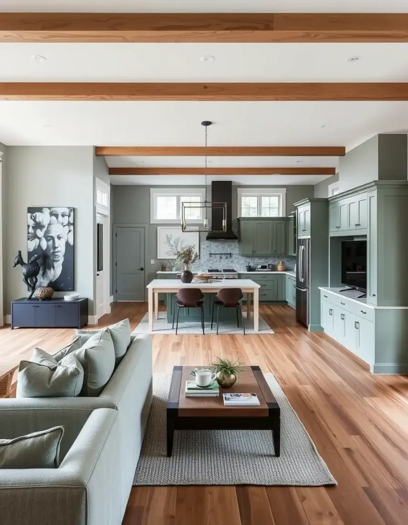
In open layouts, color combinations for home need continuity. Choose a base color (like soft white) for 60% of walls, a secondary tone (like pale gray) for 30%, and an accent (navy) for 10%. This 60-30-10 rule ensures rhythm without monotony.
For interior house colors, carry accent hues through decor—pillows, art, or rugs—to link rooms. If your living room has terracotta accents, echo them in the kitchen’s backsplash or dining chairs.
6. Modern vs. Traditional: Align Colors with Style
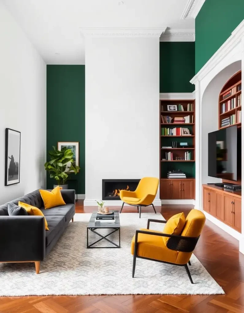
Modern home paint colors often embrace bold monochromes or high-contrast pairings (think black-and-white with metallic accents). Traditional spaces lean on rich, muted tones like burgundy or hunter green.
Mixing eras? Balance a mid-century sofa with earthy, organic walls (think clay or ochre) to bridge styles.
7. Don’t Neglect the Exterior
Exterior home paint colors set first impressions. Match your roof and landscape: A red brick home pairs elegantly with creamy whites, while a wooded lot suits forest greens. Front doors in bold hues (like cobalt or crimson) add personality without overwhelming.
Final Checklist Before Painting
-
Test samples in all lights.
-
Match undertones to furniture.
-
Align colors with room mood.
-
Use the 60-30-10 rule for flow.
Conclusion
Choosing home paint colors that complement furniture isn’t just about aesthetics—it’s about crafting a narrative. With these tips, you’ll create spaces that feel intentional, harmonious, and uniquely yours. Ready to pick up that brush?


