
Best Paint Colors for Small Rooms in 2026 That Make Spaces Look Bigger
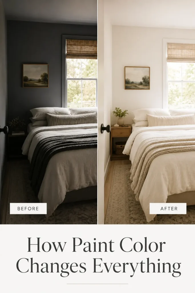
There’s something quietly powerful about a coat of fresh paint. You don’t need to knock down walls, install skylights, or spend a fortune on a renovation to make a small room feel completely different — you just need to choose the right color. And in 2026, that choice has never been more exciting.
Compact living is no longer a compromise. Micro-apartments, cozy studio spaces, and thoughtfully designed small homes are defining the way millions of people live today. According to the U.S. Census Bureau’s American Housing Survey, the average size of newly constructed homes has been gradually declining as urban density increases — meaning more of us are learning to love our smaller spaces and style them smarter.
The paint color on your walls does more than you might think. It affects how light bounces around the room, how your brain perceives depth and height, and even how relaxed or energized you feel when you walk through the door. A well-chosen shade can make a 10×10 bedroom feel like a serene retreat. The wrong one can make a perfectly decent room feel like a shoebox.
This guide covers everything you need to know — the best paint colors for small rooms in 2026, how to choose based on your room type, what finishes work best, common mistakes to avoid, and the color trends shaping interiors right now. Whether you’re refreshing a tiny apartment bathroom or giving your compact home office a new life, you’ll walk away with a clear, confident plan.
Let’s open things up.
How Paint Colors Affect Room Size Perception
Before diving into specific shades, it helps to understand why color affects the way we perceive space. It’s not magic — it’s a mix of light physics and psychology, and once you get it, you’ll never look at a paint chip the same way again.
Light Reflection and Brightness
Every paint color has a Light Reflectance Value (LRV) — a number from 0 (absorbs all light) to 100 (reflects all light). Light colors with high LRVs bounce natural and artificial light around a room, making walls appear further away and ceilings feel taller. Deep colors absorb light, pulling surfaces inward. This is why a crisp white or pale sage green can genuinely make a room feel larger — it’s not an illusion, it’s physics. The Sherwin-Williams LRV guide explains this concept well for homeowners choosing colors.
Warm vs. Cool Tones
Warm colors (creams, peaches, terracottas) tend to feel closer and cozier — which is great for creating intimacy but can tighten a small space if overdone. Cool tones (soft blues, pale greens, light grays) visually recede, making walls appear further away and rooms feel airier. This doesn’t mean warm colors are off the table in small spaces — it just means they need to be used thoughtfully, usually in their lightest, softest versions.
Color Psychology
Our brains are wired to associate certain colors with certain environments. Pale blues remind us of open sky; soft greens echo nature and expansiveness; soft whites recall clean, open spaces. Research published in Color Research & Application has consistently shown that color perception is deeply tied to mood and spatial awareness. In interior design, this translates to practical choices: calm, light colors reduce visual “noise” and make rooms feel more breathable.
The Ceiling Height Illusion
Painting your ceiling slightly lighter than your walls draws the eye upward, making the room feel taller. Conversely, a dark ceiling compresses space instantly. Many designers in 2026 are recommending “ceiling whites” — barely-there tints of the wall color — to create a seamless, airy flow from floor to ceiling.
Monochromatic Design Impact
One of the most powerful tricks in a small-space designer’s toolkit is going monochromatic — using the same color (in slightly varying shades) across walls, trim, and even ceiling. This removes visual interruption, letting the eye travel the room without stopping, which creates a perception of continuous, unbroken space. It sounds simple, but the effect is genuinely striking.
Best Paint Colors for Small Rooms in 2026
1. Soft Warm White
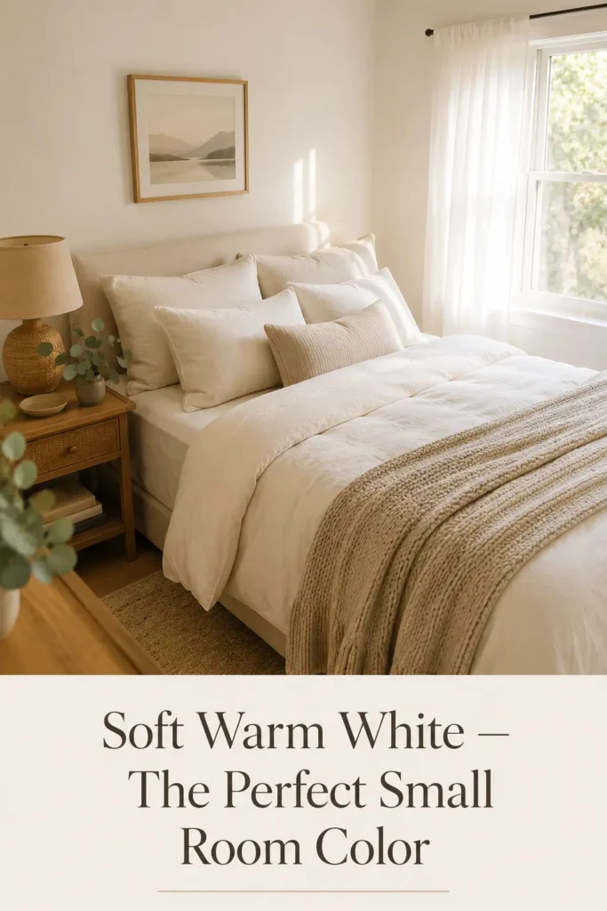
Why It Works: Soft warm white is the gold standard for small rooms — and for good reason. Unlike stark, cold white (which can feel clinical and harsh under artificial lighting), a warm white carries just a whisper of cream or yellow undertone that makes a room feel sun-kissed and inviting without sacrificing brightness. It reflects maximum light while feeling infinitely liveable.
Best Room Types: Bedrooms, living rooms, studio apartments, hallways
Natural Light Compatibility: Works beautifully in both north-facing rooms (where it prevents a cold, flat feeling) and south-facing rooms (where it stays bright without washing out)
Styling Suggestions: Pair with natural linen, rattan, blonde wood, and soft terracotta accents for a warm, organic feel. Keep furniture light-toned to maintain the airy effect.
Matching Décor Ideas: Cream linen curtains, jute rugs, wooden shelves with ceramic pots, minimalist artwork in simple wood frames.
Pros: Maximum light reflection, works with virtually any décor style, timeless and resale-friendly, makes rooms feel clean and open. Cons: Can show marks and scuffs more easily; requires quality paint for even coverage.
Popular options to explore: Dulux Antique White USA, Farrow & Ball Wimborne White, Benjamin Moore White Dove.
2. Light Greige
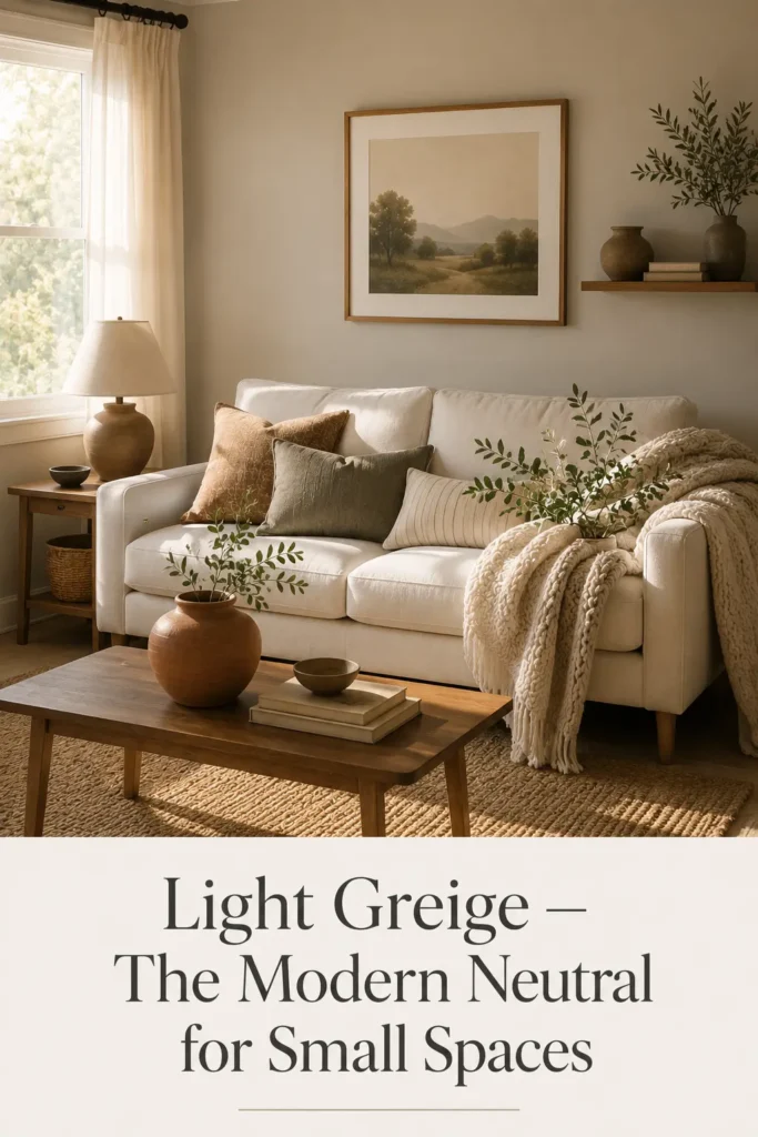
Why It Works: Greige — the beautiful marriage of gray and beige — is the modern neutral that replaced the all-white craze of the previous decade. In 2026, light greige is everywhere in small-space design because it manages a neat trick: it feels warm and cozy while still reading as contemporary and spacious. It doesn’t overwhelm; it settles. Rooms painted in light greige feel curated and calm.
Best Room Types: Compact living rooms, home offices, guest bedrooms
Natural Light Compatibility: Particularly effective in rooms with warm afternoon light, where the beige undertones glow. In cooler north-facing rooms, choose a greige with warmer undertones to prevent it reading gray.
Styling Suggestions: Greige is a brilliant backdrop for layering textures — think chunky knit throws, velvet cushions, brushed brass hardware. It doesn’t compete; it complements.
Matching Décor Ideas: Warm charcoal accents, mid-tone wood furniture, terracotta ceramics, sage green plants.
Pros: Incredibly versatile, hides imperfections better than bright white, feels sophisticated and grounded. Cons: Can lean too gray or too beige depending on light — always test a large sample before committing.
3. Pale Sage Green
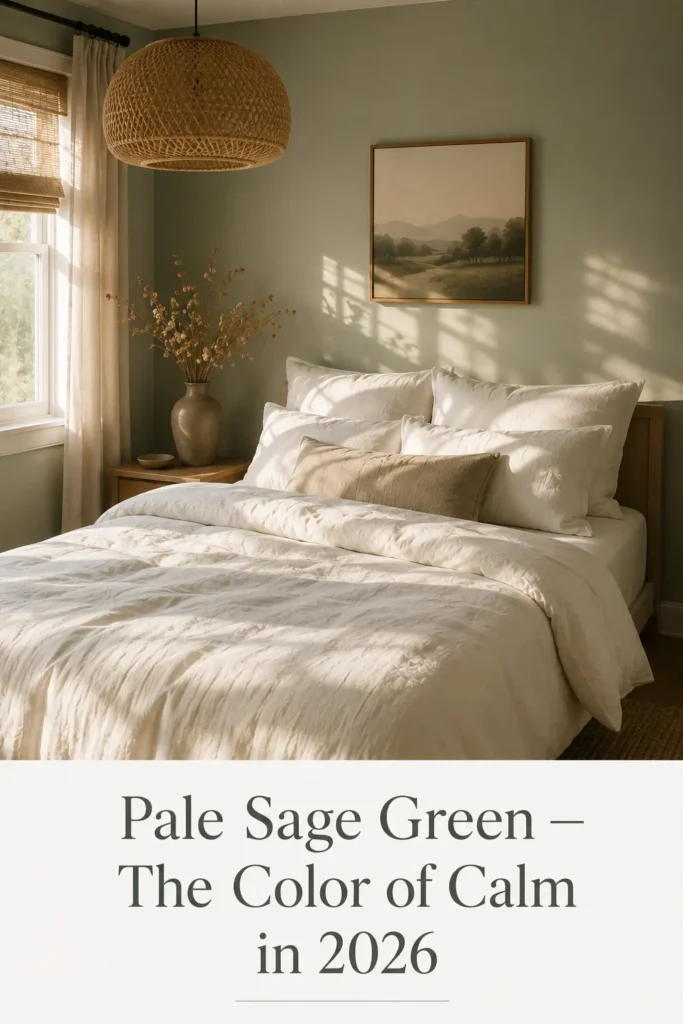
Why It Works: Pale sage is the color of 2026. Nature-inspired, restorative, and effortlessly stylish, it brings a sense of calm openness to compact rooms that few other colors can match. Sage works because it references the outdoors — the eye associates it with space, growth, and fresh air — without being so bold that it visually closes a room in.
Best Room Types: Bedrooms, bathrooms, small living rooms, meditation or reading nooks
Natural Light Compatibility: Glows warmly in natural daylight. In artificial light, choose a sage with olive undertones rather than gray to keep it feeling alive rather than dull.
Styling Suggestions: Let sage be the hero and keep the rest simple — white trim, natural wood, linen fabrics, terracotta or clay-toned accessories.
Matching Décor Ideas: Rattan furniture, cream linen bedding, potted indoor plants (which become part of the color palette), warm brass or matte black hardware.
Pros: Calming, on-trend without being trendy, connects indoor-outdoor living. Cons: Can trend toward khaki or gray if undertones aren’t checked against your specific lighting.
4. Misty Blue
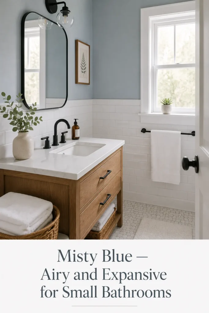
Why It Works: Pale, dusty blues have been a secret weapon in small-space design for decades. Misty blue — think the color of a hazy morning sky — creates a cool, airy atmosphere that visually pushes walls outward. It’s one of the most effective colors for making compact rooms feel significantly larger because it taps into our deep environmental association of blue with openness and distance.
Best Room Types: Bathrooms, small bedrooms, studio apartments, coastal or Hamptons-style homes
Natural Light Compatibility: Excellent in well-lit south or east-facing rooms. In lower-light spaces, go lighter — almost white-blue — to prevent the room from feeling cold.
Styling Suggestions: Keep it soft and serene. White bedding, driftwood textures, glass accessories, and natural linen keep the coastal lightness going without tipping into kitsch.
Matching Décor Ideas: White trim and ceiling, linen curtains in white or pale sand, rattan or whitewashed wood, navy as a grounding accent color.
Pros: Visually expansive, refreshing, works brilliantly in bathrooms and bedrooms. Cons: In rooms with very little natural light, it can feel cool and unwelcoming.
5. Creamy Beige
Why It Works: Creamy beige is the warm, welcoming alternative to stark white — and it genuinely outperforms white in low-light rooms. Where white can turn flat and cold under artificial lighting, creamy beige glows. It has just enough warmth to make a room feel alive, while its lightness keeps the space feeling open and unconfined.
Best Room Types: Hallways, north-facing bedrooms, compact dining rooms, rooms with limited windows
Natural Light Compatibility: Best suited to lower-light rooms where it prevents a gloomy, enclosed feeling.
Styling Suggestions: Pair with warm metals (gold, brass), earthy textures (jute, wool, wood), and layered soft furnishings. Think less minimal, more collected-and-cozy.
Matching Décor Ideas: Warm white trim, honey-toned wood furniture, terracotta accessories, warm-toned artwork.
Pros: Warm and welcoming, hides marks well, very liveable. Cons: Can read as dated if paired with very cool-toned furniture or accessories.
6. Dusty Lavender
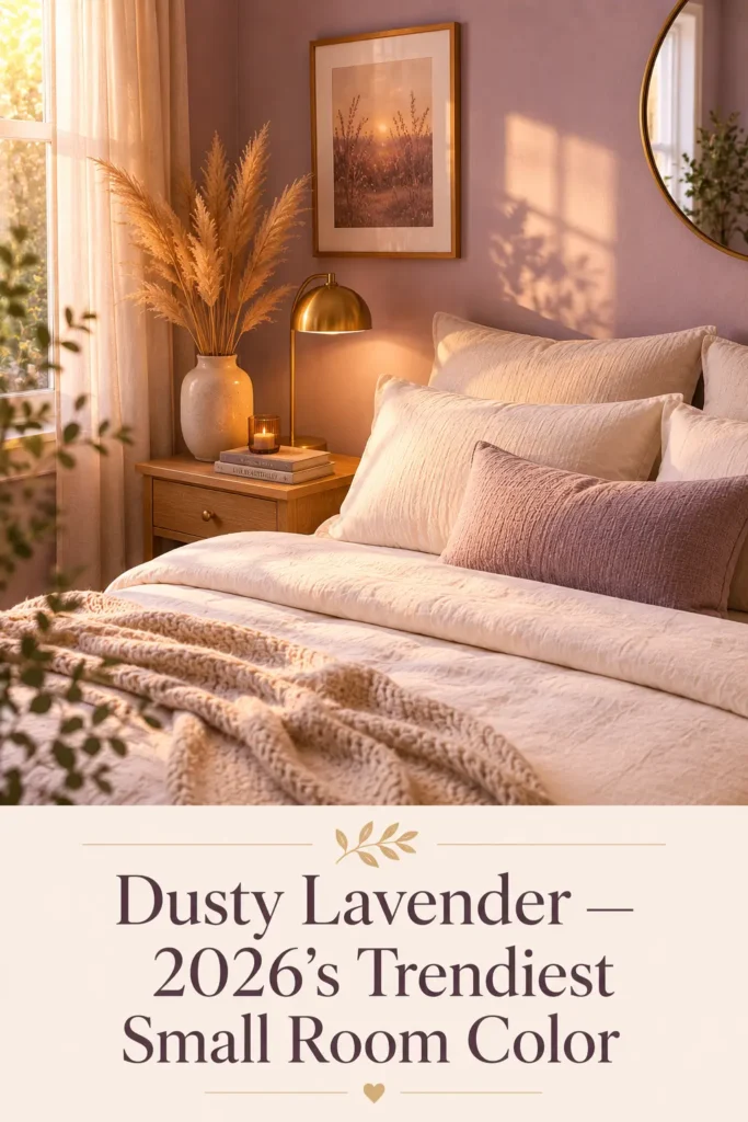
Why It Works: Dusty lavender is having a major moment in 2026 — and rightfully so. Unlike bright purple (which can overwhelm a small room), dusty lavender is a muted, soft version that reads more like a neutral with a personality. It has an almost watercolor quality that makes rooms feel soft, dreamy, and a little larger than they are.
Best Room Types: Bedrooms, reading nooks, powder rooms, creative studio spaces
Natural Light Compatibility: Beautiful in morning light (east-facing rooms). In evening-only artificial light, choose a warmer, less blue-based lavender.
Styling Suggestions: Pair with warm whites, brushed gold hardware, soft grays, and natural wood. Lavender pairs unexpectedly well with warm terracotta for a modern earthy-romantic look.
Matching Décor Ideas: Cream bedding, dried flower arrangements, rattan accessories, soft gray or warm white furniture.
Pros: Unique and stylish, calming, feels fresh and current in 2026. Cons: Polarizing — not for everyone’s taste; needs careful undertone selection to avoid looking cold.
7. Soft Taupe
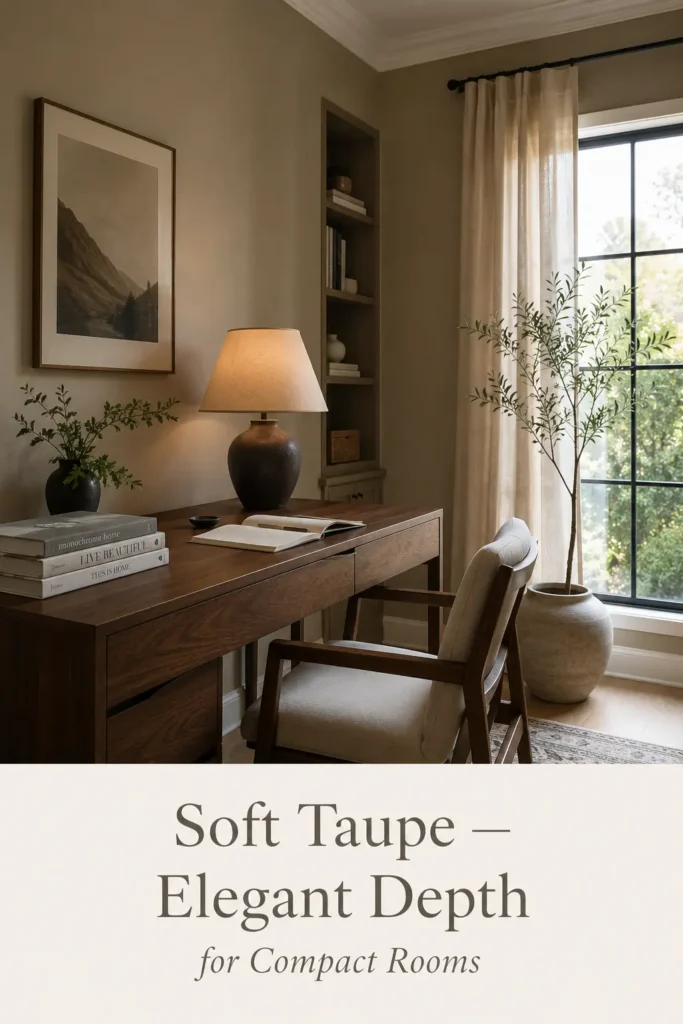
Why It Works: Taupe occupies a warm middle ground between beige and gray — and that balance is what makes it so effective in small rooms. It feels sophisticated without trying too hard. It pairs beautifully with natural wood textures, making it a go-to for Japandi-inspired or organic modern interiors, both of which are defining aesthetics in 2026.
Best Room Types: Living rooms, bedrooms, home offices, dining areas
Natural Light Compatibility: Works across most lighting conditions; warmer taupes perform best in cool-light rooms.
Styling Suggestions: Layer textures heavily — linen, leather, wool, wood, stone. Taupe is a foundation color that makes everything on top of it feel intentional and rich.
Matching Décor Ideas: Mid-tone walnut furniture, cream linen, olive green plants, matte black hardware.
Pros: Elegant, timeless, works brilliantly with natural materials. Cons: Can read flat if not styled with enough textural contrast.
8. Pale Blush Pink
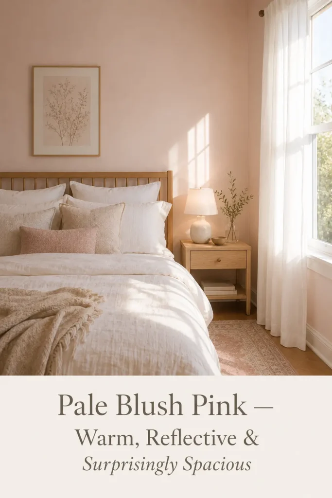
Why It Works: Pale blush pink — barely pink, really — is one of the most underrated small-room colors. It has the reflective warmth of white with a softness that feels genuinely welcoming. In a well-lit room, it glows without shouting. In interior design circles, very soft blush is frequently used in minimalist spaces because it adds warmth without weight.
Best Room Types: Bedrooms, powder rooms, walk-in wardrobes, small sitting rooms
Natural Light Compatibility: Spectacular in south or west-facing rooms. Avoid in already warm or orange-light-heavy rooms where it can tip into salmon.
Styling Suggestions: Keep it minimal and intentional. White furniture, natural linen, simple botanical prints, and warm wood tones are natural companions.
Matching Décor Ideas: Cream and white bedding, blonde wood furniture, soft white curtains, minimal brushed gold accents.
Pros: Warm, reflective, romantic without being overwhelming, unexpectedly versatile. Cons: Not suited to masculine or more industrial aesthetics; undertones need careful testing.
9. Cool Light Gray
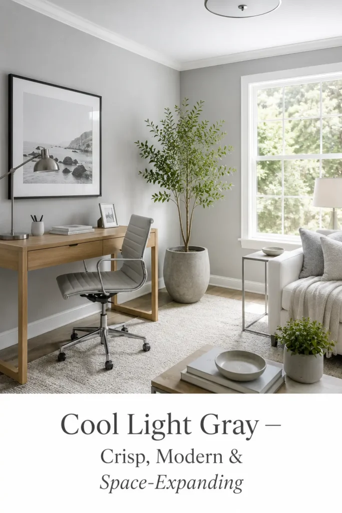
Why It Works: Light gray remains a cornerstone of contemporary small-space design, and in 2026 it’s being used in subtler, more sophisticated ways. The trick is choosing a gray with blue or green undertones rather than purple, which can feel cold and institutional. The right light gray feels clean, modern, and visually expansive — especially under natural daylight.
Best Room Types: Home offices, modern living rooms, kitchens, contemporary apartments
Natural Light Compatibility: Best in rooms with ample natural light. Without it, cool grays can feel dim and heavy.
Styling Suggestions: Use crisp white trim to keep it fresh. Add warmth through textiles — a rust-colored throw, a mustard cushion — to prevent the room feeling stark.
Matching Décor Ideas: White and concrete-look accessories, geometric prints, brushed silver or chrome hardware, statement plants.
Pros: Modern, clean, pairs well with contemporary furniture. Cons: Can feel cold if there’s not enough warm contrast in the room.
10. Muted Sand Tone
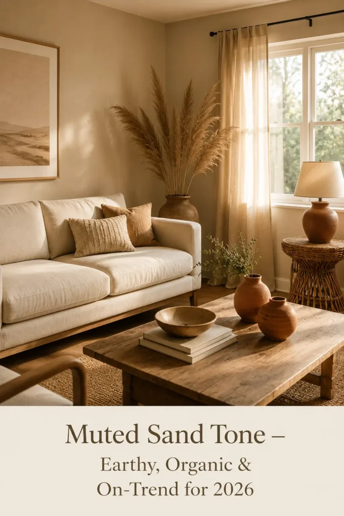
Why It Works: Muted sand is the earthy, organic color trend that’s dominating interiors in 2026. It’s not quite beige, not quite cream — it’s warmer and more textured in feeling, like the color of sun-bleached linen or dry coastal sand. In small rooms, it creates a relaxed, organic atmosphere that feels grounded and spacious at the same time.
Best Room Types: Living rooms, bedrooms, studio apartments, bohemian or organic modern interiors
Natural Light Compatibility: Works well across most lighting situations; particularly striking in rooms with warm afternoon light.
Styling Suggestions: Layer natural materials — rattan, wicker, raw linen, clay ceramics, terracotta. Let the texture do the talking.
Matching Décor Ideas: Warm white or cream trim, jute rugs, wooden furniture with visible grain, dried botanicals.
Pros: On-trend, organic, deeply liveable, beautiful with natural materials. Cons: Can feel muddy in very low-light rooms if not chosen carefully.
Paint Color Comparison Table
| Color | LRV Range | Best Room | Light Requirement | 2026 Trend Score |
|---|---|---|---|---|
| Soft Warm White | 80–90 | Any room | Low to high | ⭐⭐⭐⭐⭐ |
| Light Greige | 60–75 | Living room, office | Medium–high | ⭐⭐⭐⭐⭐ |
| Pale Sage Green | 55–70 | Bedroom, bathroom | Medium | ⭐⭐⭐⭐⭐ |
| Misty Blue | 60–72 | Bathroom, bedroom | High | ⭐⭐⭐⭐ |
| Creamy Beige | 65–78 | Hallway, dim rooms | Low–medium | ⭐⭐⭐⭐ |
| Dusty Lavender | 50–65 | Bedroom, powder room | Medium–high | ⭐⭐⭐⭐⭐ |
| Soft Taupe | 55–68 | Living room, office | Any | ⭐⭐⭐⭐ |
| Pale Blush Pink | 65–78 | Bedroom, powder room | High | ⭐⭐⭐⭐ |
| Cool Light Gray | 60–74 | Office, kitchen | High | ⭐⭐⭐⭐ |
| Muted Sand Tone | 58–72 | Living room, studio | Medium–high | ⭐⭐⭐⭐⭐ |
Best Paint Colors for Different Small Rooms
Small Bedrooms
The bedroom is where you need to feel genuinely relaxed, so resist the urge to go too bold. Pale sage green, soft warm white, and dusty lavender are standout choices. They lower the visual temperature of the room, making it feel calmer and more spacious. For a romantic, luxurious feel in a tiny bedroom, consider pale blush pink with white trim — the combination is quietly stunning. Explore more ideas in our guide to bedroom design and décor.
Tiny Living Rooms
Your living room carries the most social pressure — it’s where guests form their first impression of your home. Light greige and soft taupe are ideal: they feel polished and current, they pair with nearly any furniture color, and they have enough warmth to feel welcoming. Add a large mirror to amplify the light-reflecting work of the paint.
Compact Kitchens
Kitchens benefit from colors that feel clean and easy. Soft warm white keeps things fresh and food-friendly. Misty blue is a beautiful choice for coastal or Hamptons-style kitchens. Avoid anything too dark or saturated — in a kitchen, contrast is better achieved through hardware and cabinetry finishes than through wall color. Discover more kitchen inspiration in our kitchen category.
Small Bathrooms
Bathrooms are where pale blues and soft sage greens genuinely shine. The association with water and nature makes these colors feel especially at home here — and their cool undertones make even a tiny bathroom feel refreshing. Semi-gloss finish on the walls adds light-bouncing function alongside the color. See more ideas in our bathroom collection.
Home Offices
Your home office needs to feel focused and calm without being dull. Cool light gray or light greige work beautifully here — they’re professional and contemporary without the clinical feel of stark white. Pair with warm wood furniture and good task lighting to keep the space feeling energized. We cover more office styling ideas in our home office section.
Studio Apartments
In a studio, the best approach is consistent color throughout — ideally a single soft tone across all walls to create a seamless, continuous feeling of space. Muted sand, warm white, or light greige are ideal studio shades. Break up the space with rugs and furniture arrangement rather than contrasting wall colors, which will chop up an already small footprint.
Hallways
Hallways are often neglected — but a well-painted hallway sets the tone for your entire home. Creamy beige and soft warm white both work brilliantly in narrow, often-dark hallways. They reflect light from connecting rooms and create a sense of welcome rather than constriction. Check out our hallway design ideas for more inspiration.
Paint Finishes That Help Small Rooms Look Bigger
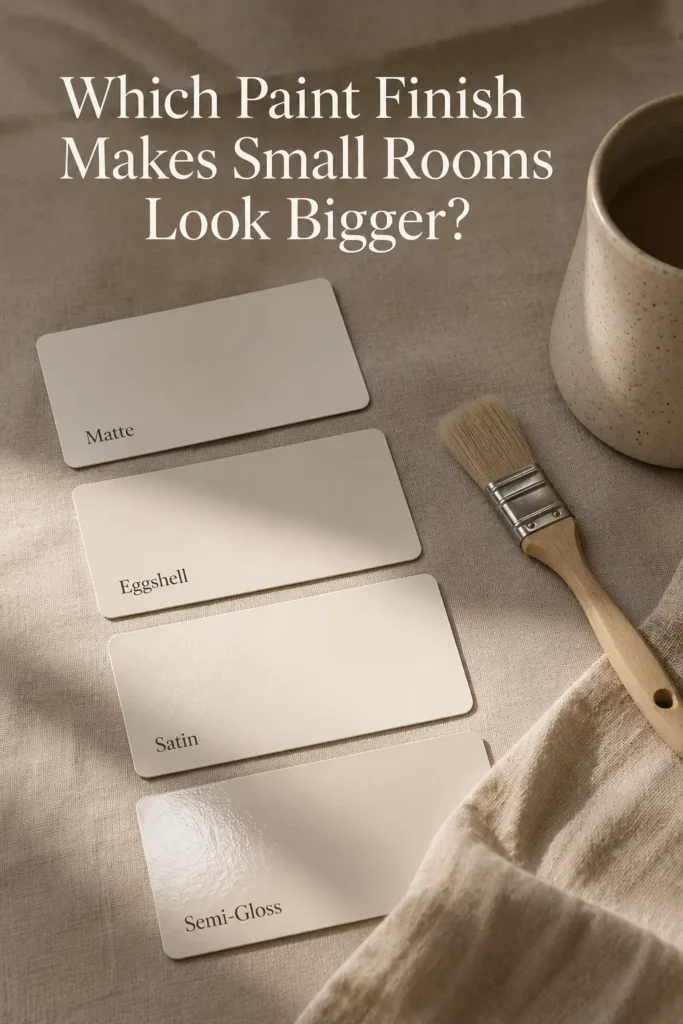
Choosing the right color is only half the job — the finish you select will significantly affect how that color performs in your room.
Matte Finish absorbs light and creates a velvety, sophisticated look. It’s beautiful on walls with imperfections because it doesn’t highlight them the way a glossy finish would. The downside is that it doesn’t reflect much light — so in very small rooms, it can dampen the room-expanding effect of your chosen color. Best used in rooms that get ample natural light.
Eggshell Finish is the sweet spot for most small rooms. It has just enough sheen to bounce light softly around the room without looking obviously glossy. It’s also more washable than flat/matte, making it practical for high-traffic small rooms like hallways and living areas. This is the finish most professional painters recommend for interior walls.
Satin Finish has a noticeably higher sheen than eggshell and reflects significantly more light. It’s particularly useful in north-facing rooms or spaces with limited windows — the extra light-bounce can make a genuine visual difference. It’s also very durable and easy to clean, making it popular for kitchens, bathrooms, and children’s rooms.
Semi-Gloss for Accents is best reserved for trim, doors, and window frames rather than full walls in a small room. Semi-gloss trim creates a clean, bright border that makes walls feel crisper and rooms feel more defined — without overwhelming a small space with too much sheen.
According to painting professionals at Consumer Reports, eggshell and satin finishes consistently outperform matte for practicality and light reflection in most interior applications.
Color Pairing & Décor Tips for Small Spaces
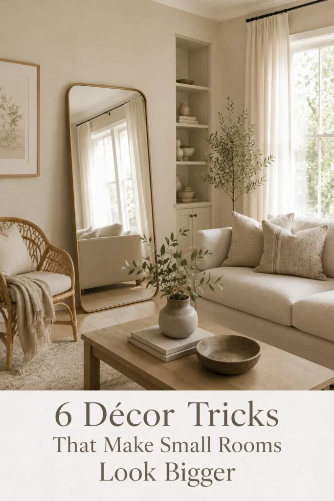
A great paint color is the foundation — but how you style the room around it is what truly opens up the space.
Matching Furniture Tones: In a small room, furniture that blends with the wall color creates visual continuity. If your walls are soft greige, honey wood furniture merges gently rather than creating hard visual stops. Reserve contrast for intentional accent pieces — a cushion, a lamp, a piece of artwork.
Minimalist Décor Styling: The fewer items competing for attention, the larger any room feels. Edit ruthlessly. Choose pieces that serve both a functional and aesthetic purpose — a beautiful rattan basket that also stores throws, a handsome wooden tray that organizes the coffee table. Less stuff, more space.
Mirror Placement: Mirrors are perhaps the single most powerful tool for expanding a small room visually. A large mirror placed opposite a window doubles the apparent depth of natural light in a room. Lean it floor-to-ceiling for maximum impact. Interior design experts at Architectural Digest consistently rate strategic mirror placement among the top five small-space tricks.
Curtains and Soft Furnishings: Hang curtains high (near the ceiling, not at window height) and wide (extending well past the window frame). This frames the window without covering it, drawing the eye upward and making windows — and by extension, rooms — appear larger. Stick to light, sheer fabrics in small rooms.
Monochromatic Color Schemes: Painting walls, trim, and ceiling in varying tones of the same color creates a seamless envelope effect — the room becomes one continuous, uninterrupted space. Try: walls in soft warm white, trim in a brighter white, ceiling in a barely-there cream. The effect is subtle but genuinely impactful.
Accent Wall Tips: Accent walls are tricky in small rooms. If you go for one, choose the wall furthest from the door — this creates a sense of depth rather than closing the room in. Keep the accent color relatively soft — a deep sage rather than a forest green, a warm terracotta rather than a brick red. And only use one accent wall; any more and you risk fragmenting the space.
Common Paint Mistakes That Make Small Rooms Feel Smaller
Even the best-chosen paint color can backfire if these common mistakes trip you up.
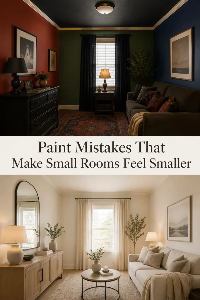
Dark Ceiling Colors: This is the single most common small-room mistake. Painting a ceiling in a dramatically dark shade is a design move that works in large, high-ceilinged rooms — in a small space, it’s like putting a lid on a box. Always keep ceilings lighter than the walls. Even a pure white ceiling in a room with warm-toned walls will lift the space considerably.
Overusing Accent Walls: One thoughtfully placed accent wall can add depth. Multiple accent walls, or an accent wall that’s too boldly colored, creates visual chaos in a small room. The eye doesn’t know where to settle, and the space feels fragmented. In rooms under around 150 square feet, consider skipping the accent wall entirely and relying on artwork or furniture for visual interest instead.
Poor Lighting Combinations: Even the most carefully chosen light paint color will underperform in poor lighting. If you’ve painted a room soft sage green but you’re relying on a single warm-toned bulb in the middle of the ceiling, the color won’t read as intended. Layered lighting — ambient, task, and accent — makes every paint color perform better. Use daylight-spectrum bulbs (around 4000–5000K) to see your paint color as intended.
Heavy Contrasting Furniture: Dark, oversized furniture in a light-painted small room creates a clash of visual weight. The light paint does its best to open the room — then a heavy mahogany wardrobe undoes all the work. Choose furniture that’s appropriately scaled for the room, and where possible, opt for lighter or leg-raised pieces that let light pass underneath.
Too Many Bold Colors: A single room with multiple bold colors is almost always a mistake in a small space. If you want to use a deeper, bolder tone, commit to a monochromatic approach — using that color throughout in varying intensities — rather than mixing it with competing bold tones.
Ignoring Natural Light Direction: The direction a room faces affects how your paint color reads throughout the day. North-facing rooms receive cool, indirect light that can make some colors (especially grays and blues) feel cold and flat. South-facing rooms are warm and bright — almost any color works here. East-facing rooms get warm morning light and cool afternoon light. West-facing rooms are dim in the morning and warm and golden in the evening. Always factor in orientation when choosing your shade.
Interior Color Trends for 2026
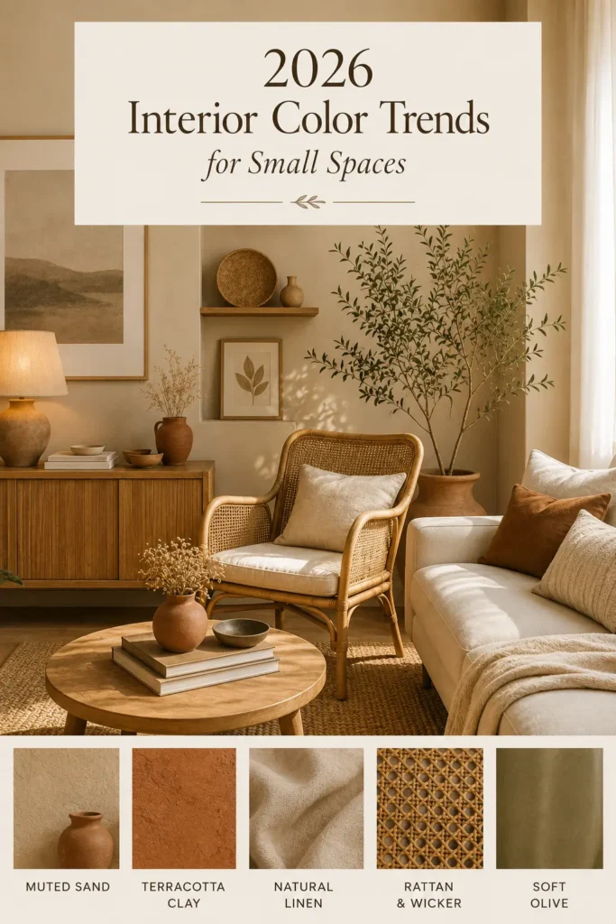
The interior design world in 2026 is moving decisively away from cool, stark, and minimal — and toward warm, earthy, and nuanced. Here’s what’s shaping small-space color choices this year.
Warm Neutrals Everywhere: The cold, gray-dominant palette of the 2010s is firmly behind us. In 2026, warm neutrals — creams, warm whites, light taupes, and sandy tones — are the foundation of almost every aspirational interior. They feel comforting without being heavy, and they pair beautifully with the natural materials trend.
Earth-Inspired Tones: Terracotta, warm clay, dusty rose, and muted ochre are making their way into interiors as accent colors and, increasingly, as wall colors in their lighter forms. Pale terracotta, for example, is a stunning choice for a bedroom or dining room wall in 2026 — warm, rich, but still spacious in its lighter expressions.
Japandi-Inspired Palettes: The fusion of Japanese minimalism and Scandinavian warmth continues to dominate in 2026. Japandi interiors favor soft, muted colors — warm white, pale sage, soft taupe, gentle off-black — combined with natural wood, linen, and ceramics. For small spaces, this aesthetic is practically made to order: it prizes simplicity, breathing room, and the beauty of empty space. Learn more about creating a Japandi-inspired space in our furniture and design category.
Soft Minimalist Palettes: Minimalism isn’t going anywhere — but in 2026, it’s warmer and more human. Instead of cold white and gray, think warm white and greige. Instead of stainless steel, think brushed brass and warm wood. The emotional temperature of minimalism has risen, and small spaces are direct beneficiaries.
Nature-Inspired Calming Shades: Biophilic design — the practice of bringing nature’s colors, textures, and materials inside — continues to grow. Pale sage, misty blue, warm stone, and bark-toned neutrals all reference natural environments and create the sense of openness associated with outdoor spaces. The World Green Building Council has published research connecting nature-inspired interiors with reduced stress and improved wellbeing, which is driving demand for these palettes.
Sustainable Design Aesthetics: With growing awareness of environmental impact, the colors associated with sustainability — earthy greens, natural browns, clean whites — are becoming the visual language of responsible interior design. In 2026, choosing a natural, earthy palette signals values as much as aesthetic preference.
Budget-Friendly Ways to Refresh Small Rooms With Paint
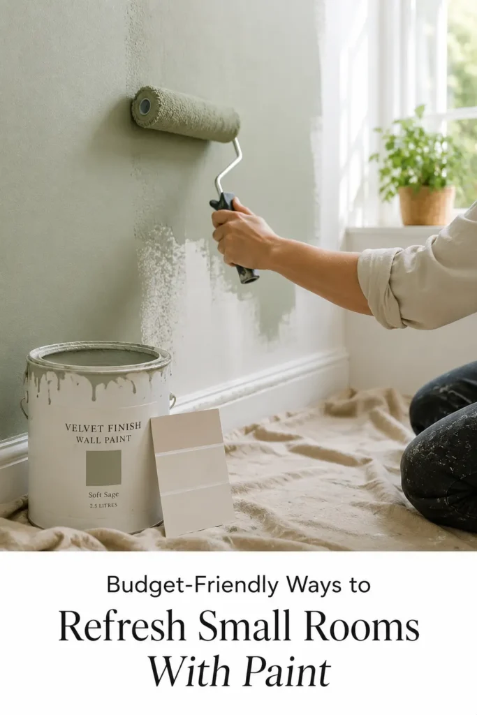
Transforming a small room with paint doesn’t have to cost a fortune. Here’s how to make the most impact without maxing out your budget.
DIY Painting Tips: With good preparation, you don’t need a professional for most interior wall painting projects. Clean walls thoroughly before painting. Fill any cracks or holes. Use high-quality painter’s tape on trim and edges. Apply two coats for proper coverage. Invest in a good-quality roller — cheap rollers leave texture that looks unprofessional. A quality brush and roller can often make more difference than expensive paint.
Accent Updates: If repainting an entire room feels too daunting or expensive, refresh just one wall. A single freshly painted wall — ideally the focal wall opposite the door — can transform the feel of a room at a fraction of the cost and effort of a full repaint.
Repainting Furniture: Old furniture can get a second life with paint. A dated wooden dresser in soft warm white or pale sage can look like a designer piece. Use chalk paint for furniture — it adheres without primer and gives a beautifully matte, sophisticated finish.
Affordable Décor Refresh Ideas: Change cushion covers, swap out a lamp shade, add a new rug in a complementary tone. These simple updates work in concert with fresh paint to create a completely new room feeling without significant expenditure. Our home DIY category is full of affordable refresh ideas.
Rental-Friendly Paint Solutions: If you’re renting, check with your landlord about painting — many are surprisingly open to it, especially if you commit to repainting in white before you leave. Alternatively, peel-and-stick removable wallpaper panels in neutral tones can add visual interest to a feature wall without permanent commitment.
Quick Weekend Makeover Ideas: A small room can be fully painted over a weekend — prep on Saturday, first coat Saturday afternoon, second coat Sunday morning. By Sunday evening, you have a completely transformed space. Add new shelf styling and fresh flowers, and the room will feel brand new.
Designer’s Favourite Small-Space Colors
When interior design professionals work with compact spaces, certain colors come up time and time again. Here’s what the experts consistently reach for:
Benjamin Moore White Dove (OC-17): One of the most beloved warm whites in professional interior design. It has just enough cream to feel welcoming without looking yellow, and it pairs with almost anything.
Farrow & Ball Mizzle (No. 266): A soft, complex sage with warm green and gray undertones that looks different in every light — always sophisticated, always fresh.
Dulux Natural White: An Australian favourite and reliable go-to for warm, reflective walls in compact rooms. Enduringly popular for good reason.
Sherwin-Williams Accessible Beige (SW 7036): One of the most popular greige tones in North America — warm enough to feel cozy, light enough to feel spacious.
Resene Feta: A soft sage green that’s been popular with Australian and New Zealand designers for its ability to bring nature inside without overwhelming small rooms.
Frequently Asked Questions
Which paint color makes a small room look biggest?
Soft warm white consistently delivers the biggest visual expansion in small rooms. Its high light reflectance value bounces natural and artificial light around the room, creating the illusion of depth and distance. If white feels too plain, light greige or pale sage green are excellent alternatives that offer more personality while still maximizing the sense of space.
Are white walls best for small rooms?
White is genuinely one of the best choices — but it’s not the only one, and it’s not always the right one. In low-light rooms, stark white can look flat and gray rather than clean and bright. Warm whites, creamy beiges, and light greiges often perform better in rooms with limited natural light. The “best” color depends on your room’s light levels, orientation, and the feeling you want to create.
What colors should I avoid in small spaces?
Avoid very dark colors on all four walls — they absorb light and make spaces feel enclosed. Avoid using multiple bold or contrasting colors in one small room, as visual fragmentation makes spaces feel chaotic and smaller. Be cautious with saturated colors (deep reds, navy, forest green) unless you’re using them in a deliberately moody, cocoon-like way with carefully planned lighting.
Do cool colors make rooms look larger?
Yes, generally. Cool colors (soft blues, pale greens, cool grays) visually recede — meaning they appear further away than they actually are, which makes walls seem more distant and rooms feel larger. This effect is most pronounced in rooms with good natural light. In darker rooms, cool colors can sometimes feel cold rather than spacious.
Which paint finish works best for small rooms?
Eggshell is the most versatile and recommended finish for most small room walls. It reflects enough light to enhance the room-expanding properties of your color choice while being practical, washable, and easy to maintain. Satin is a step up in sheen and works well in rooms with limited natural light. Reserve semi-gloss for trim only.
Can dark colors work in small rooms?
Yes — if used with intention. A room painted in a deep, rich tone can feel luxurious and intentionally moody rather than cramped, particularly when paired with excellent lighting, carefully chosen furniture, and mirrors. The trick is committing fully to the dark palette rather than combining it with light colors, which creates a jarring contrast. Dark rooms work best when the color covers walls, ceiling, and trim in a tone-on-tone approach.
What is the best paint color for low-light rooms?
Creamy beige and soft warm white outperform other light colors in rooms with little natural light. They have warm undertones that remain inviting under artificial lighting, where cooler colors (light gray, pale blue) can turn flat or cold. If the room has absolutely no natural light, consider adding a warm-spectrum uplighter to complement the paint color.
How do I make a small bedroom look luxurious?
A small bedroom can feel genuinely luxurious with the right combination of paint, lighting, and textiles. Choose a soft, warm paint color — pale sage, warm white, or dusty lavender. Layer high-quality bedding in neutral tones. Add a bedside lamp with a warm bulb. Hang curtains ceiling-to-floor. Use a large mirror strategically placed to reflect light. A few well-chosen plants add life and freshness. Luxury in a small bedroom is less about size and more about the quality and cohesion of every element.
Conclusion
Small spaces have a quiet magic to them — they force you to be intentional, to choose carefully, and to make every square foot count. And few choices carry more weight in a compact room than the color on the walls.
In 2026, the direction is clear: warm, soft, nature-inspired shades that balance livability with visual openness. Whether you gravitate toward the clean reliability of soft warm white, the sophisticated calm of pale sage green, or the contemporary warmth of light greige, the right paint color can make a space feel genuinely and measurably larger — without touching a single wall.
The best approach is to test before you commit. Paint sample cards of three or four favorites on a large piece of white card (at least A3 size), hold them against your walls, and observe how they look at different times of day and under your specific artificial lighting. The color that looks perfect in the paint shop may surprise you in your room — and vice versa.
Most importantly, choose a color that feels like you. The most technically perfect small-space color is worth nothing if you don’t actually enjoy living with it. Spaciousness is important — but so is personality, warmth, and the feeling that your home genuinely belongs to you.
Start with one room. See how it feels. And don’t be afraid to enjoy the process — there are few more rewarding weekend projects than watching a coat of the right paint completely transform a space you live in every single day.
For more home improvement inspiration, browse our guides on painting techniques, lighting for interiors, living room design, and seasonal décor ideas.

")